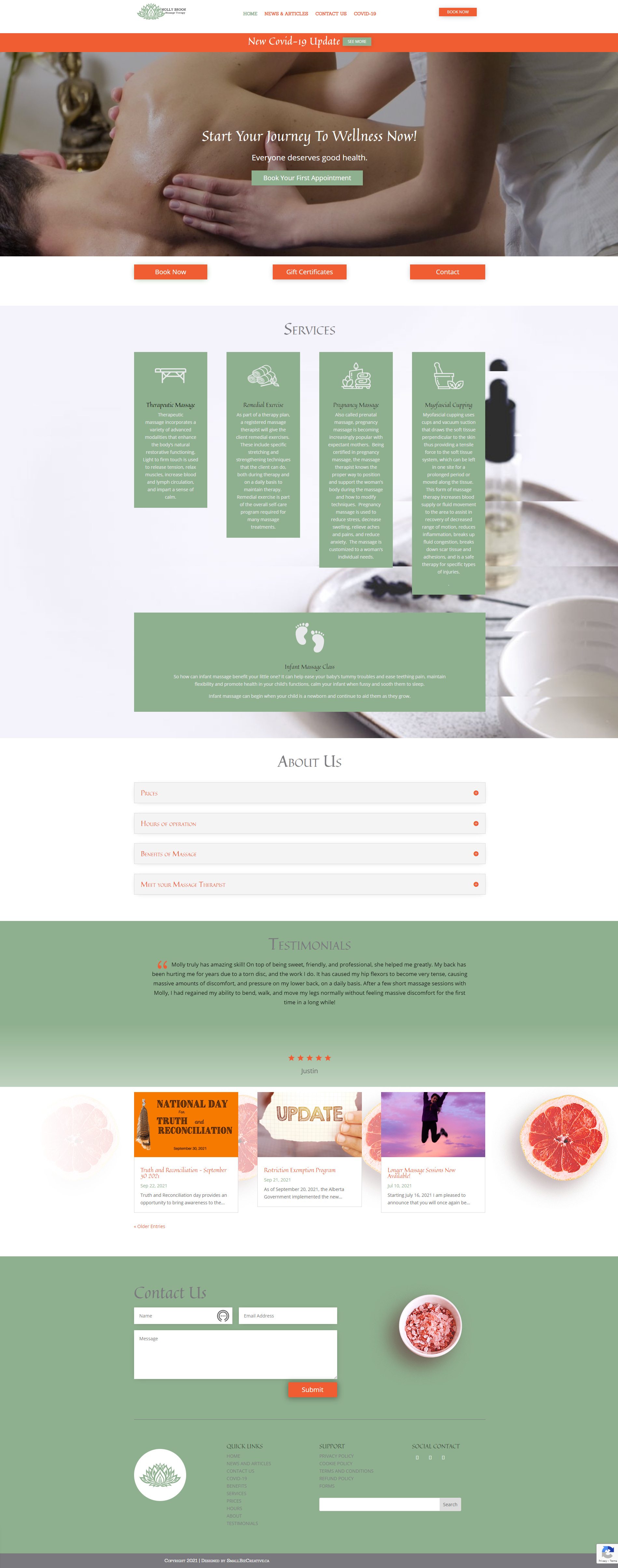
Molly Brook Massage Therapy
The Problem
Registered massage therapy practitioners (RMT) often rent space within an existing wellness clinic, so focusing on their business brand is imperative. Her brand called for a significant online presence. This client wanted to be precisely clear about what they offer (and what they don’t offer) to remain within the regulatory standards of a medical practitioner and still build an engaging clientele.
The Need
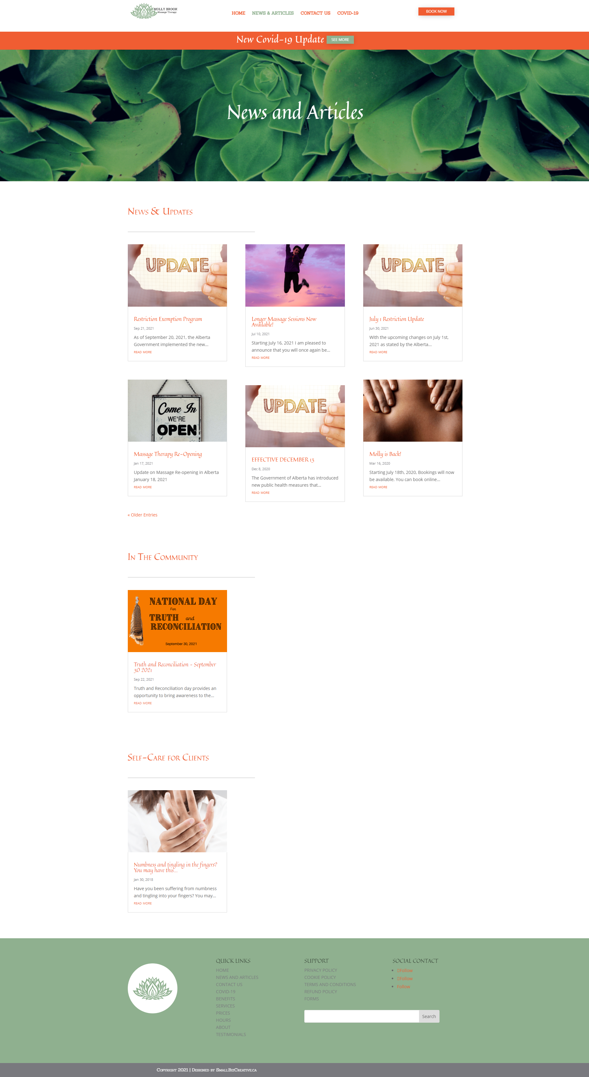
The site needed a complete design overhaul, specific calls to action such as signing up to a newsletter, social connections, and the ability to book online with the approved, integrated bookings platform used by the RMTs in her area. Having worked with our design team for a logo, she wanted the essence of calm that her logo conveyed. Her clients needed the confidence that all COVID protocols and mandates were in place and that privacy and confidentiality were of utmost concern.
The Solution
The original green and white logo colors offered the calm essence requested, but something was missing. It needed another color; the energy that conveyed the personality and enthusiasm of the RMT was the perfect balance between calm and spark, a fresh pop. SBC made the site with navigation simplicity and easy-to-find calls to action. Transparency in fees, hours of operation, and the benefits of massage needed a home where clients could dig deeper without having to filter through pages. The new site has significantly improved the user experience.